Creating a mobile menu
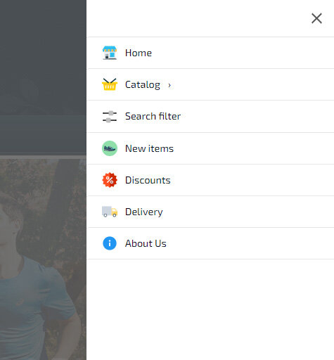
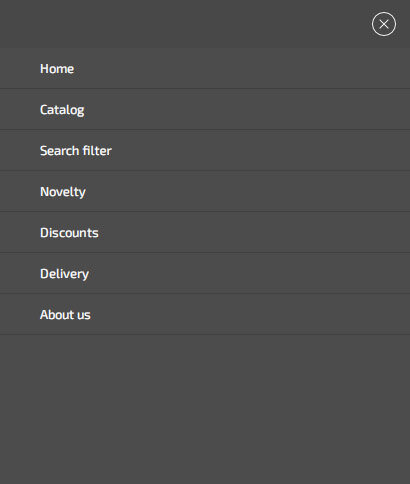
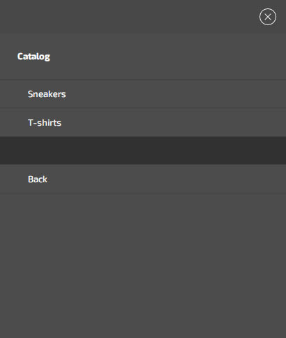
You can create a mobile menu block with your own icons and drop-down menu items and sub-items. To do this, go to the "My Blocks/Menu" section and select "Mobile Menu: Application" and click "Add Mobile Block/Menu". Select the icons you want to display, create menu items and click save.
This mobile menu code is cached and activated only at the specified screen size (by default - less than 768px). The mobile menu builder allows you to use custom cart icons, a search dropdown menu, a search filter, popup pages with ajax data loading (no page refresh), popup feedback and callback forms, favorites and products comparison icons. You can change the color of the mobile menu and icons, upload your own icons, change the order of the icons, and hide the main header of the site or its elements.
Replacing the mobile menu button
The mobile menu can load at a certain screen size or when you press a button. To enable loading of the mobile menu using a button, in the «Mobile Menu: Application» section, open the desired menu, and in the «Menu Activation» tab, enable «Replace the mobile menu call button». You can use any «Class» or «ID» to activate the mobile menu. By default, if the «Main Menu» is enabled, it will be hidden on the screen less than 768px and replaced with the «.hotengine-mainmenu-mobile-icon» element. This element will be used as a mobile button unless you specify a custom element. For a mobile menu, you can set the position, width, background, design style, and also set icons.